
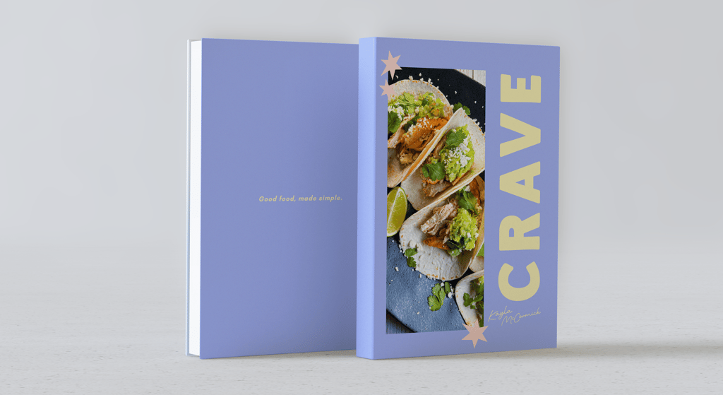
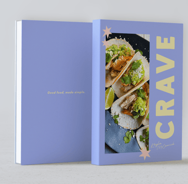
CRAVE
Show Me How
This cookbook explores how editorial design can make cooking feel accessible,engaging and less intimidating. Crave was designed for home cooks who value simplicity and flexibility, bringing a new perspective to recipes to feel approachable rather than a rigid experience. The goal was to create a book that encourages users to cook confidently, putting emphasis on enjoyment rather than perfection.
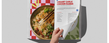
A key challenge was balancing a strong visual personality while still having clear usability. Cookbooks require a structured and easy-to-follow layout, but this can feel overdone and they lose visual interest. At the same time, bold typography and bright colors risk being overwhelming or disrupting readability. Creating a system that maintains clarity while still being energetic was important to making the cookbook both functional and engaging.
The final design uses a structured grid system to organize information, paired with bold typography and a vibrant color palette to give more personality. Large-scale food imagery was the eye catcher of each spread, while the ingredients and instructions are clearly separated for quick navigation. Repetition of certain elements creates consistency, while variations in each layout keep each page dynamic. The result is a cookbook that feels inviting, presenting cooking as a creative process rather than a precise task.

Publication Design
Objective
Design a visually engaging book that makes cooking feel approachable and enjoyable. The publication should balance clear instruction content with a bold visual style that encourages users to cook without intimidation.
Concept
Crave is created around the idea that cooking should feel casual, not like a chore. It should be enjoyable, not perfect. The cookbook emphasizes comfort food with elevated flavors, presenting recipes as approachable experiences.
Target Audience
Visual Direction
Beginner to intermediate home cooks
Young adults
Audience who values visual design
Bright, playful color palette to reflect energy and accessibility
Bold & oversized typography for strong hierarchy
Graphic elements to add personality
Clear, structured layouts to keep recipes easy to follow