
PSTCH
Milk, but better
This project dives into how branding and packaging can differentiate a product within an over saturated market. PSTCH is a pistachio-based milk brand designed to catch the attention of design-conscious and health focused consumers. The goal was to create a strong visual identity that communicates simplicity, quality ingredients, and confidence while still being eye catching on a shelf.
Breaking away from the traditional visuals of the milk industry, which often relies on soft colors and predictable layouts was the main challenge. Creating something that stood out without losing approachability required a delicate balance between minimalism and visual impact. The identity needed to be intentional, while still being recognizable and engaging in a retail environment.
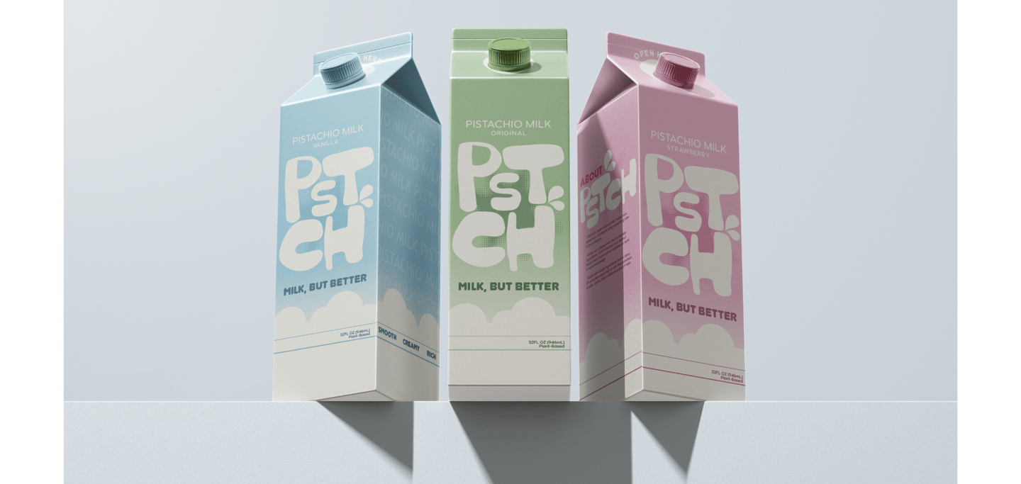
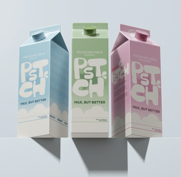
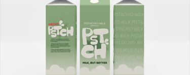
The final design is centered around bold, unique typography as the main visual element, allowing for the packaging to stand out without relying on excessive graphics. The simplistic name reflects the brand’s focus on simplicity, reinforcing the idea of fewer ingredients. Minimal layouts and strong hierarchy ensure clarity, while the use of different colors to differentiate flavors offers a cohesive system. These elements create a brand identity that is modern, confident and instantly recognizable.

Brand Identity & Packaging Design
Objective
Develop a distinctive brand identity and packaging system for a pistachio milk brand that stands out. The goal is to communicate simplicity, quality ingredients, and a strong visual presence through bold typography and minimal design.
Concept
PSTCH reimagines plant-based milk branding by moving away from the soft and overly friendly concept. PSTCH embraces a design-forward approach that uses confident typography, minimal ingredient messaging, and clean layouts to create a modern and elevated identity.
The name itself is stripped down, removing vowels from Pistachio mirrors that brand's focus on simplicity. This idea carries through the entire design system: fewer ingredients, fewer distractions, stronger impact.
Visual Direction
Bold & expressive typography as the main visual element
Minimal layouts that prioritize clarity and readability
Strategic use of color to differentiate flavors
Clean packaging that reflects ingredients transparency
Tone & Experience
Clear and concise
Confident
Modern and design conscious
Minimal
Target Audience
Gen Z and millennial consumers
Design-conscious shoppers
Health-focused individuals who enjoy plant based alternatives
Customers shopping at grocery stores like Whole Foods, Central Market, Sprouts and Trader Joes