
MORNING AFFO
Lattes & Goodies
Morning Affo is a cafe brand that combines coffee culture with the warmth of a good morning routine. The goal was to create a cohesive identity that feels inviting while maintaining strong visuals across packaging and print materials. The brand is aimed to appeal to customers who value both comfort and design.
A challenge within the design process was attempting to balance playfulness with clarity. Cafe branding can often lean into either minimalism or an overly decorative aesthetic, causing difficulty in creating something that is unique without being visually overstimulating. The identity needed to represent warmth and personality while remaining structured enough to function across packaging, menus, and overall branding.
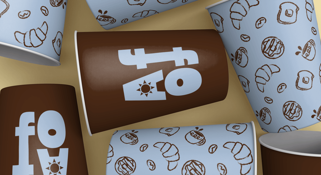
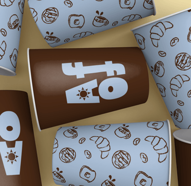
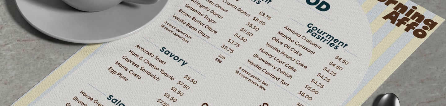
The final design uses bold, expressive typography as the main visual element. Pairing it with a warm, cafe-inspired color palette helps represent an inviting tone. Hand-drawn illustrations introduce a sense of personality and texture. The repeating patterns extend the brand identity across different applications. Clean layouts ensure readability and usability, allowing for the brand to be functional while still feeling playful. These elements create a creative brand identity that stands out while capturing the comfort of a morning cafe.

Brand Identity & Packaging Design
Objective
Create a cohesive brand identity for a cafe that combines coffee culture with baked goods. The goal is to focus on simplicity, visual recognition and the warmth of a cafe. The design system should feel inviting and playful while maintaining clarity and consistency across packaging and print materials.
Concept
Morning Affo was created around the feeling of a comforting morning. When you have your coffee in hand and a fresh pastry in hand. The brand combines this feeling with a bold, graphic identity that allows it to visually stand out. The name and brand system lean into feeling approachable while still being design focused. The concept combines bold typography, simple forms and a limited but rich color palette.
Tone & Voice
Visual Direction
Warm & inviting
Casual
Playful without being childish
Focused on comfort
Chunky, expressive typography for strong brand recognition
Warm cafe inspired color palette
Hand-drawn illustrations to add personality
Repeating patterns for packaging and brand cohesion