
LABOUR
Typographic Monolouge
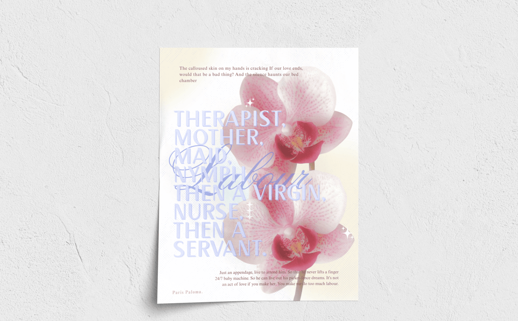
This piece explores how typography can communicate emotional and emotional social narratives without solely relying on imagery. Using the lyrics from the song Labour by Paris Paloma, the design explored and translates the themes of gender roles and emotional labor into a visual format that reflects the mental weight that is put on a person. The intention was to create a poster that feels less like reading lyrics and more like entering someone's emotional state.
Getting this message across required balancing clarity with intensity. The content is dense and emotionally charged, which makes it difficult to organize in a visually impactful way without it losing its impact or feeling overly cluttered in an unappealing way. At the same time, the goal of the poster was to feel overwhelming without becoming unreadable. Creating a strong distinction between the internal voice and external pressures
The final design relies on typography as both structure and expression. Stacking and overlapping text builds a sense of suffocation, while the hierarchy guides the viewer through key moments. Contrasting fonts allows for the distinction of societal roles and the emotional resistance. The floral elements and muted pastels reference traditional femininity, disrupted by bold red accents that suggest strain. Together, they create a poster that is visually appealing while drawing the viewer in to look at the weight of the message.

Poster Design
Objective
The goal for this project was to translate song lyrics into a visual monologue using expressive typography, hierarchy and composition. The goal was to convey emotional weight and narrative progression without relying heavily on imagery, allowing for the typography to act as the main voice and the atmosphere.
Concept
This poster design explores the emotional and physical labor that is pushed onto women within relationships, inspired by Labour by Paris Paloma. The lyrics are very layered, fragmented and overwhelming.
The composition reflects the progression of self identity. From the roles pushed onto women to a loss of autonomy, building up to the idea of being a servant. The overlapping text creates a sense of suffocation and repetition, driving the idea of the nature of these expectations.
Typography
Hierarchy
Contrasting fonts were used to create a clear distinction between the internal voice and the societal labels.
Large and stacked texts emphasize the identites
Script typography interrupts the structure, representation the emotional resistance
Dense layering mimics the mental overload
Certain phrases are more prominent to guide the viewer through the narrative
The composition is meant to intentionally crowd the poster to create tension
Color & Imagery
Soft floral contrasts with the heavy message, referencing traditional femineity
The orchid symbolizes beauty, fragility and expectation
Muted pastels paired with bold reds contrast delicacy and harm
Tone & Message
This piece is meant to balance softness with discomfort. While visually delicate at first glance, the content shows a critical perspective on gender roles, emotional labor and identity erasure.