
ABSTRAKT
Minga London
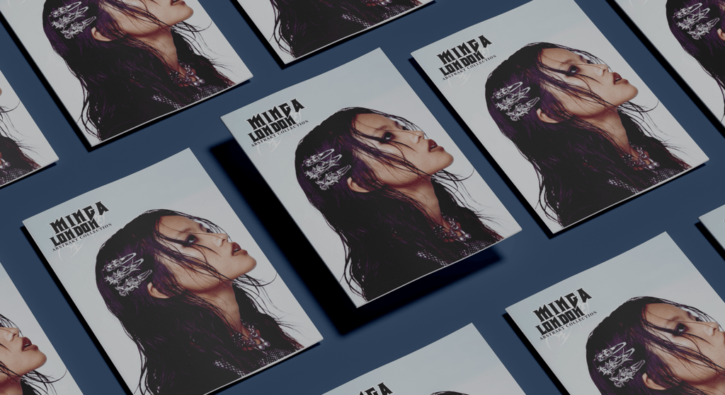
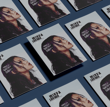
The ABSTRAKT Collection Zine explores how editorial design can shape the perception of a fashion collection through structure and visual identity. The zine was created for Minga London’s ABSTRAKT collection with the goal of blending grunge and underground streetwear aesthetics into a cohesive publication. The zine is meant to present the collection in a way that is elevated while still capturing its rebellious attitude for an audience drawn to alternative fashion.
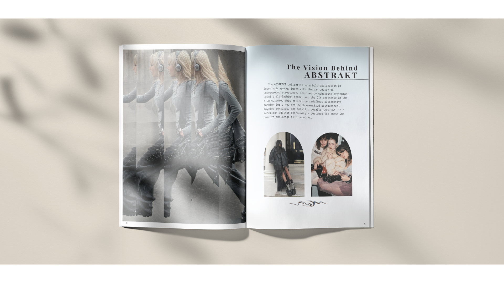
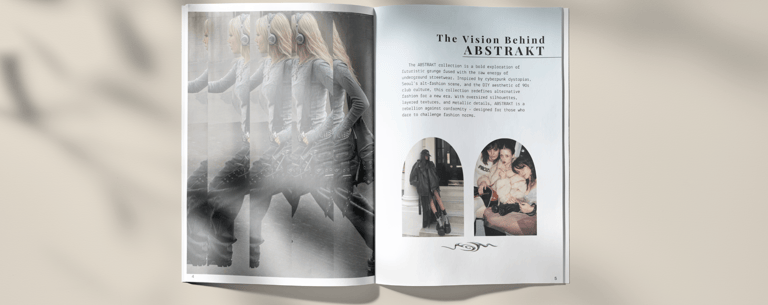
Balancing clarity with expression was important for the design process. The collection is bold and offers a complex style, which created the challenge of showcasing strong, detailed imagery without overwhelming the layout. The publication needed to feel clean and readable while reflecting the aesthetic of the clothes. Creating a system that could maintain consistency across multiple spreads, while allowing for variation and visual interest was the key.
The final zine uses a structured grid that is paired with a minimalistic layout to give space for the garments and styling to take focus. Sharp, stylized typography establishes hierarchy and reinforces the brand’s tone, while the design and consistency creates a rhythm throughout the zine. With subtle variations like cropped layouts, full bleed images, and product focused spreads, gives movement without breaking cohesion. A simple color palette supports the imagery further and allows for the collection to remain as the focal point.
Fashion Zine
Objective
Design a multipage magazine that introduces Minga London's collection, ABSTRAKT. Blend product storytelling with a strong visual identity. The publication should feel cohesive, elevated and reflect the whole vibe of the collection.
Concept
ABSTRAKT is meant to be a bold and alternative fashion collection that combines aesthetics from grunge, underground streetwear, and cyberpunk. The zine serves as a look book that showcases the rebellious collection.
Visual Direction
Minimal & structured layouts
Neutral & muted tones to allow products to stand out
Sharp, stylized typography to reinforce the rebellious identity
Clean grid system to maintain clarity